Monday 28 March 2011

Film Names

Today I home I thought of some film names and conducted research into them by gaining feedback from my family and friends to see what they thought of them. Below is a picture of my brainstorm:


The film names are in green and the pink text is the feedback that I recieved. After conducting this research, I felt that the name 'RETRIBUTION' was the most popular and fit our genre very well. People I'd spoken to also told me that this was more appealing to them and they found this name more attractive. The other names were too child like and associated with school, but not in the context that we want. Instantly when we created our narrative I thought of the name 'RETRIBUTION' because I felt that it fitted the storyline perfectly. Now I have to present my research to my group and see what they think so we can make a final decision.

Friday 25 March 2011

Character Profiles

Today at home I formed character profiles for the two characters featured within our opening sequence. This is important to do because it allows me to better understand how these characters inform our narrative and it also allows us to explain to our cast the type of personality that their character has, which will help them to get more into character and perform their role to the best of their ability. *Note, I only included a back story for the abuser because his role in developing the narrative is essential as we learn the reason as to why he wants to gain retribution through his back story. Below is a picture of my work:

Wednesday 23 March 2011

Storyboard

As a group we individually created our own storyboards. We will all present of our ideas to one another and take bits from each others that we feel work well together to make one final storyboard. Below is my storyboard and the initial ideas of how I think our opening sequence should be.


Scene Breakdown


 1) Black screen slowly fades into girl.

  - The establishing shot will be of the girl waking up in the basement after being abused. She has been left unconscious after being hit in the head.

 2) Flashback

    - The next shot will show the girl getting ready for school in the morning.

    - She will be putting the tie of her school uniform on and doing her hair.

3) Black screen slowly fades into girl.

    - There will be a close-up of the girl's neck and arm which are covered in blood and bruises after being physically abused by her teacher.

4) Flashback

    - We will see the girl walking to school talking on the phone and laughing, showing how she is content.

5) Black screen slowly fades into girl.

    - We then see a high-angle shot of the girl tied in the chair, showing how she is being watched and is vulnerable .

6) Flashback

    - Another shot is shown of the girl who arrives at school, which is her destination.

7) Black screen slowly fades into girl.

   - There is a pan of the girl in the environment she is surrounded by.

   - Her abuser arrives and says "Now, where was I?" in an evil way which makes us assume that he is going to finish where he left off.

FADE TO BLACK.

Tuesday 22 March 2011

Scripting

Although the majority of our opening sequence doesn't consist of any dialogue, we do have one line which is said and therefore it is still important to devise a script as this will have an impact on our sequence i.e. it will inform how we construct the clips and establish the precise moment of when we incorporate this speech. It is also important for the cast to know when and how they should deliver their lines. Below is the script that I created:


FADE TO SURROUNDING:

- Girl is sitting in the chair observing the room of where she's been kidnapped and the situation that she's in.

- She looks around up and down, from left to right.

- There is complete silence which resonates throughout the room.

- The only sound we hear is of the movement of the girl in the chair as she struggles to break free.

- We see two big feet emerge onto the screen which approach the girl,  and suspect that they are male.

FADE TO BLACK:

"Now, where was I?" is said by Ally in an evil and sinister way. There is a long pause after the word "Now" which creates suspense and heightens tension for the audience.

- The audience get an uneasy feel of something not being right. We assume that somebody very bad is about to ocurr.

Monday 21 March 2011

Preliminary Task

This is the final edited version of my preliminary task:


It was really easy to make and less time consuming than making our music video (as we did A2 before AS due to certain circumstances) and I was able to complete it within a day. The purpose of it was to show continuity editing of somebody opening a door and walking through it, as stated within the specification. We also needed to include over-the-shoulder shots and maintain the 180 degree rule. I thoroughly feel as though my preliminary tasks embodies all of the criteria and I'm very happy with the outcome. I was already familiar with Adobe Premiere and its features so therefore I used them to the best of my ability to ensure the task was completed to a suitable standard.

Sunday 20 March 2011

Props We Require

Now that we have decided on our treatment, I am going to conduct some research into the types of props that we will require for our mise-en-scene. Choosing props is very important as they are what makes your mise-en-scene look authentic for the audience.

Blood:


We will need to find some source of material that we can make look like fake blood. Due to the fact that we don't have a budget to work with, we will have to ask the Art department in school for permission to use some of their ink water paints. These will look more authentic on Megi and will give a better effect for the audience rather than having just red paint.

Gaffa Tape:


We will also require some gaffa tape for Megi to show that she has been kidnapped. It will look similar to the woman in the picture on the right. However, we are thinking about using black gaffa tape as black has connotations of evil and sinister so therefore it instigates questions about Megi's abuser and the intentions that he/she has.

Rope:


We will also need some thick rope to tie Megi to the chair. It has to be thick to show that she is tied very tightly to the chair and secure so that she cannot break free from her abuser who has left her in this condition. It will show the struggle that is created as she tries to break free when she wakes up from being unconscious. However, we may have a struggle trying to find rope so we considered an alternative by using Megi's own scarf that she will wear to school on the day in the film to tie her up. The scarf however will not be as secure so will therefore not look professional for the audience as Megi will easily be able to break free, so therefore we will have to consider other options.

Chair:


Initially, we would like to use a standard chair like the one in the image on the left as it very plain and shows that the abuser has kept Megi within an old, neglected basement. By using props like this, it says a lot of about her abuser and thus creates questions and suspense for the audience. The image on the right gives you an initial idea of what we hope to achieve. However, finding a chair of this standard would be quite hard to do so therefore we will ask the Drama department about what props they have available and whether we could use them.

Uniform:


We will need Megi to wear a full school uniform like the girl in the picture above, completed by a blazer, blouse and trousers. This is to show that Megi is a normal school girl who is on her way to school and gets kidnapped. Her blouse will later be of significance as her abuser has taken her blazer off her and some of her buttons are undone on her blouse to show that she has been harmed. I don't think we will have any problems asking a Head house within the school to borrow some uniform, so therefore this is one prop we don't have to worry about.


Final Idea and Treatment

We decided that our final idea would be of a teacher who has pyschological issues due to his past experiences to which he seeks revenge on innocent school children. As a result of being abused by his teacher when he was younger, he develops a vendetta against students and abuses them as a way of gaining retribution. Our opening sequence will consist of a young girl who has been tortured and tied up to a chair as a result of the abuse she has suffered at the hands of her teacher. We will also incorporate flashbacks of the girl showing her journey to school before she gets abused. 

The treatment will start off with the girl waking up after being abused as she was left unconscious as a result of being hit in the head by her teacher, the abuser. We will then show a flashback of her getting ready for school in the toilet by putting her tie for her uniform on and doing her hair. After this we will then go back to the present of the girl tied up in the chair and show her bruises/cuts on her arm which she panics after seeing. These serve to convey how she has been physically abused. Another flashback will then be shown, showing her journey of walking to school whilst she is talking on the phone, smiling and laughing displaying how she is content and happy. Again, we will return back to the present where the camera looks down on her from a high-angle, whilst she is sitting tied up in her chair and looking around, as if she is being watched by her torturer. The last flashback will then be shown of her entering the gates of the reception of her school as she arrives at her destination. We then return back to the present where there is a pan of the girl sitting in the chair before her abuser arrives, takes the gaffa tape off her mouth and says "Now, where was I?" in a sinister, deliberate way as he prepares to finish where he left off.

There is some unresolved feeling as we are left with a cliffhanger because we assume that the abuser will kill her and eventually pursue further victims. As Megi, the girl who plays the victim, is dressed in a school uniform and arrives at school, we come to believe that her abuser is seeking students as his victims. Henceforth, the rest of the film will go on to show this.

Saturday 19 March 2011

Certificate Ratings

Existing Production Companies

Productions Companies


  • Working Title Films (UK)


  • Working Title Films is a British film production company, based in LondonUK. The company was founded by Tim Bevanand Sarah Radclyffe in 1983. It produces feature films and several television productions. Eric Fellner and Bevan are now the co-owners of the company.


    Working title includes films like:

    • Nanny McPhee
    • Mr Beans holiday
    • Paul


  • Propaganda Films (US)


  • Propaganda Films was a prolific and successful music video and film production company founded in 1983 by producers Steve Golin and Sigurjón Sighvatsson and directors David FincherNigel DickGrey Gold and Dominic Sena. By 1990, the company was producing almost a third of all music videos made in the U.S.


  • Interscope Communications (US)


  • Interscope Communications (also known as Interscope Pictures) was a motion picture production company founded in 1982 by Ted Field. Its divisions included Interscope Records(which was founded in 1990 as a joint venture with Atlantic Records).


  • A&M Films


  • A&M Films was the movie production division of A&M Records and was established in 1970 by musician Herbert Alpert and recording executive Jerry Moss. By 1983, A&M Films co-produced successful films with various Hollywood studios. In 1989, PolyGram Filmed Entertainment purchased A&M Records and continued until it was closed in 1996. In 1998, PolyGram was acquired by Seagram and Sons and A&M Records was merged with the Universal Music Group and now operates under the Interscope-Geffen-A&M label.


    Paramount Pictures Corporation

    Paramount Pictures Corporation is an American film production and distribution company, located at 5555 Melrose Avenue in Hollywood. Founded in 1912 and currently owned by media conglomerate Viacom, it is America's oldest existing film studio; it is also the last major film studio still headquartered in the Hollywood district of Los Angeles. Paramount is consistently ranked as one of the top-grossing movie studios.


    Taken from: http://sara2asmedia.blogspot.com/2011_05_01_archive.html

    Iconic Sounds

    This is the link to Sarah's blog, who is another group member. Her role was to research in the following areas:

    - Iconic Sounds
    - Existing Production Companies
    - Certificate Ratings


    http://sarahsa2mediablog.blogspot.com/

    Friday 18 March 2011

    BBFC Research


    The British Board of Film Classification

    The British Board of Film Classification is an independent, non-governmental body which has classified cinema films since it was set up in 1912 and videos/ DVDs since the Video Recordings Act was passed in 1984.

    Cinema

    The British Board of Film Censors was set up in 1912 by the film industry as an independent body to bring a degree of uniformity to the classification of film nationally.
    Statutory powers on film remain with the local councils, which may overrule any of the BBFC’s decisions, passing films we reject, banning films we have passed, and even waiving cuts, instituting new ones, or altering categories for films exhibited under their own licensing jurisdiction.

    Video

    In 1984 Parliament passed the Video Recordings Act. This act stated that, subject to certain exemptions, video recordings offered for sale or hire commercially in the UK must be classified by an authority designated by the Secretary of State. The President and Vice Presidents of the BBFC were so designated, and charged with applying the new test of ‘suitability for viewing in the home’. At this point the Board’s title was changed to the British Board of Film Classification to reflect the fact that classification plays a far larger part in the BBFC’s work than censorship.

    Finances

    The BBFC is a not for profit organisation, and its fees are adjusted only as required to cover its costs. In order to preserve its independence, the BBFC has never received subsidies from either the film industry or the government. Its income is derived solely from the fees it charges for its services, calculated by measuring the running time of films or DVDs submitted for classification. The tariff must be approved by the Department for Culture, Media and Sport (DCMS).

    Taken from http://zarahhameed.blogspot.com/

    Nine Frame Structure Analysis

    This is a 9 frame grid analysis of another horror opening sequence, our treatment for the opening sequence is pretty similar to this.
    The 9 frames show how he is lost and illusionised throughout the first 2:23 of the movie.

    Taken from http://zarahhameed.blogspot.com

    Audience Expectations

    When watching a specifically a horror movie, the audience expect something more then what you see in everyday horro movies like saw which is basically gore and grotesque they want a  unique and new experience which modern horro movies hardly provide anymore.

    The image below is basically one of the questionnaires a person has taken to show what he expects personally from a horror movie. As can be seen suspense is one of the main themes in a horror movie for him and most people expect to be shocked and experience scary feelings, otherwise they havent experienced the whole horror movie concept. Human threats interests this specific person in also watching a horror movie. So a horror movie has to be all rounded to suit most people expectations of a horror movie in todays world.

    These are a few of the responses people gave when asked what their expectations were of a horror movie:
    1.) Well killings of course. But i like twists. I like to think one thing is going to happen for sure, but then be tottaly wrong at the end.

    2.) Well, special effects are important but, for me – I like those that are visually scary and have a good story line to them. The ones that are just a bunch of blood and guts bore me to death.

    3.)I *hope* that the movie would have a scary looking dude/monster, blood, a good story line, a sad scene, and.. that’s basically it!
    Something like “Pumpkin Head”, or “Haunted in Connecticut”, or “The Messengers”! They were scary!!
    Ooo! Good horror movies have to have zombie type of things in them. Or Paranormal things, like weird dead looking ghosts, or dead looking kids… now thats scary!!


    Taken From:
    http://zarahhameed.blogspot.com/2011/05/audience-expectations-of-horror-movie.html

    Still Frame Analysis

    5 still framed pictures, analyse the mise-en-scene within them. from the same genre.
    Psychomania Opening Credits
    This is a scene from the opening credits of Psychomnia, a horror movie. An extreme eye-level shot displays this grave-yard scene, the scene is very smoky which can connote a suspicous atmosphere as they might not want some things to be seen. A dark cloud is seen above the grave-yard, dark colours like black and grey have am evil, negative connotation along with spiritual symbolisation. The image has a very dark contrast which is a stereotypical convention of a horror movie scene.

    Friday The 13 Part III Opening Credits
    This horror opening sequence from the movie 'Friday The 13 Part III' displays the more sinister representation of a horror movie, most of the screen consists of pitch black, the centre of the image shows a male head, giving off a grotesque bizzare sense of whats going on, the shot zooms into the head which created suspicion to what the head symbolises. This shot is made to show that is does not use any digital technology to use light within the image, the light used is from the candles and a beam of light coming from the back. 
      
    Freddy vs Jason Opening Credits
    This horror movie is abit different to the ones analysed above, it consists of way more movement unlike the two above which are very still and not much activity is present, this shots mise-en-scene challenges sterortypes of horror movies. (As most horror movies are slow but have grotesque content and the sound and atmosphere makes the story) however looking at the shot above it may seem to look like an action/thrillr movie however the only aspect holding us back from thinking that is the dark contrast and the gloomy colours used within the image above.
    Day Of The Dead (1985) George A Romero Opening Credits.
    This image again differs from the rest of the images previously analysed, th mise-en-scene consists of more light. The scene is very stereotypical of a horror scene in some ways in the sensethat the scene does not consist of much activity, it is slow in order to awake suspicion. This sense of isolation and closed environment around the individual allows us to acknowledge the person is suffering and they are trying to get away from something (this something could be the horror element of the movies opening sequence) or something unusual is taking place. The pure white mise-en-scene is used to connote strength and bluntness.  


    Jason X 1 Opening Credits
    This opening sequence from the movie Jason X 1 features a very revoluntionary opening scene. What we seem to see is probably an explosion or some sort of an invasion or landing. It is not clear from the image above what exactly it is. The image is not very clear, there is alot going on, however the colours used within the scene are very connotive of negativity. The black would represent evil, bad and darkness whilst the mouldy colour represents dullness and something prevading the scene. This scene in itself consists of alot of elements.
     
     
    Taken from:

    Research Into Typical Synopsis

    Here is the link to another group member, Zarah who is in charge of researching:

    - Research into typical synopsis
    - Still frame analysis
    - Nine frame structure analysis
    - Audience expectations


    http://zarahhameed.blogspot.com/

    Thursday 17 March 2011

    DVD/Poster Analysis


    Understanding Camera Shots/Angles/Movement

    Media Research

    Taken from: http://megi-asmedia.blogspot.com/

    Research Into Iconic Thriller Directors


    Taken from: http://megi-asmedia.blogspot.com/search?updated-max=2011-03-14T11%3A08%3A00-07%3A00&max-results=7

    History of Thriller

    Here is the link to Megi, one of our group members blog. As we split the research for pre-production between ourselves, Megi was in charge of researching:

    - History of Thriller
    - Research into iconic thriller directors
    - DVD/poster analysis
    - Understanding camera angles/shots/movements


    History of Thriller

    Information for the powerpoint and sources:

    A Thriller contains certain characteristics. The pace must be quick, there has to be a lot of action, and there should be suspense and plot twists aplenty. Thrillers should have the reader on the edge of their seat, wondering if the good guy can get one over the bad guy and save the world (even though it's extremely rare for the bad guy to win, in your classic Thriller).
    Thrillers are often set in exotic locations, although this isn't mandatory and certain sub-genres, like Crime thrillers, don't have this characteristic. The main characters are also traditionally men, with a career that leads them into the plot; spies, armed forces, elite government forces, and of course, chiseled good looks. Sometimes the protagonist is an ordinary citizen who is drawn into the plot, but he (and it's almost always a he) is usually square jawed and cut out for danger anyway. Women are being introduced as protagonists in contemporary thrillers to a limited extent, usually as law enforcement officers, but it's still a fairly male dominated genre. It has also been suggested that Thrillers require the protagonist to solve a current and pressing problem and prevent its occurrence, rather than chase down a criminal who has already committed a crime. The crimes, or evil forces, or bad guys, have to be grand scale as well. The Bill certainly wouldn't count as a Thriller, but Red Dragoncertainly would.

    http://www.illiterarty.com/genre-thriller


    http://allmoviesearch.com/category/genres/thriller


    Taken from: http://megi-asmedia.blogspot.com/

    Wednesday 16 March 2011

    Font Analysis

    I decided to analyse some existing thriller opening sequences as part of my research in order to observe the type of fonts they use and how they may/may not conform to the thriller genre. I also looked at thriller DVD cover to see whether they kept to a house-style and used the same or similar fonts.

    Opening Sequences:

    'Se7en' Opening Credits:


    The font featured in this opening sequence is quite child like. It is almost as if it has been hand written and is relatively small. I believe this has been done to keep the emphasis on the fast paced cut between shots which are informing what the film will be like. The font is also in white and is small to stand out against the clips. This is a sequence I've seen with one of the smallest fonts. The font is also quite jumpy and looks quite old which creates an eerie effect for the audience, especially as it accompanied by gory images in the background. This is therefore typical of the thriller genre as it creates suspense for the audience and already contains clues/messages in the sequence of what is to come in the film. It also suggests that a child may be involved through the child-like font. The non-diagetic music playing is also quite scary in the sense that has an eerie sound to it, which accompanies the credits and thus creates an effective opening sequence.

    'Panic Room' Opening Sequence:


    The font featured in this opening sequence for the thriller 'Panic Room' is very bold. The fact that it is all in capitals reinforces this and shows how the credits are of importance. Although all of the credits are generally big in size, some of them are smaller to give emphasis on the names e.g. 'MUSIC BY' is smaller compared to the name 'HOWARD SHORE' at 1.17.  The credits are also displayed against a natural backdrop of a city. The music is also very intense and heightens tension which coincides with the credits to create an effect on the audience such as suspense.

    'Vacancy' Opening Sequence:


    This is the opening sequence for the film 'Vacancy'. I chose this film to analyse as the opening sequence predominately consists of text, so therefore I thought it would be good to look at its font. The font mainly consists of the colours yellow, red and black. The font itself is very big and bold and takes up the whole of the  screen through the fancy links between each name i.e. the names follow a path which display each name in a creative and unique way. The font firstly appears as flawless, but then the name 'Vacancy' has some lines drawn into it making it appear broken and therefore indicates danger and conforms to the thriller genre. The rest of the names are also in this format too. An interesting and unique feature I picked out in this sequence is also the fact that when each name appears, some letters continue drawing a straight line as if it is portraying blood dripping as demonstrated from 0.51-0.54. At this precise moment 'Kate Beckinsale's name has the letters K and B expanding as if it were blood. This foreshadows what is later to happen in the film and the audience get a feel that the characters are going to experience something horrific.

    DVD Covers:

    'Phonebooth':


    This is the DVD cover for the thriller 'Phonebooth'. The font is very bold and stands out as an attractive feature, but isn't the main feature of the cover. The word 'PHONE' is written in captials compared to the word 'booth' which is written in lowercase. This suggests that the word 'PHONE' is of more importance and asserts the storyline and matches the image on the front of a man trapped within a phonebooth. The font is also in white with a slight touch of blue which matches the images on the cover, as they mainly consist of tones of blue and natural daylight as they are stills taken from the actual film.


    'Not Forgotten':


    I've decided to analyse the font for this DVD cover because I found it very appealing. Instantly, it caught my attention because the name of the film is written as though it is a knife with sharp points. The letters are portrayed as sharp knives through the letters F and T, which suggests that the film will have elements of murder and death. As I've already mentioned in my research, knives are a typical piece of iconography associated with the thriller, so therefore this DVD cover conforms to the genre.


    'Orphan':


    This is the DVD cover for the thriller 'Orphan'. Instantly by looking at the font style you can see that it looks like it has been written by a child and therefore you can presume that the film will be based around a protagonist who is an orphan. The name is also written in red which suggests that this orphan is associated with blood somehow and could possibly represent danger, as reinforced by the statement located underneath which says: "There's something wrong with Esther," which shows how she isn't normal.

    Overall, I can conclude that the majority of fonts within the thriller genre are often bold, big and childlike with connotations of knives and blood as a way of representing the iconography of the genre. This shows how the iconography impacts upon the fonts because they need to enforce the genre and make sure that they conform to it so that the audience do not get confused and so that there is no distortion. It is necessary to match the genre in order to appeal to a mass audience and ensure that they perceive the genre correctly.

    Iconography Associated with the Thriller Genre

    As part of our allocated roles within our group, another of my tasks was to research into iconography associated with the thriller genre. Iconography simply means symbolic representations, which often has a conventional meaning attached to an image or object. Thrillers are easy to analyse because they often have various pieces of iconography associated with them. Iconography is very important as it is part of the mise-en-scene and therefore helps to construct certain messages for the audience.

    Knives:

      
    Knives are a typical symbol associated with a thriller as they have connotations of blood, death, pain and brutality. A typical representation of this would be in the famous knife scene from Hitchcock's film 'Psycho'. Knives are often used to show that somebody is going to get killed and thus it acts a common device to keep the audience engaged.

    Shadows:


    Silhouettes and shadows are what give a thriller the enigma and mystery for the audience. Shadows are a common piece of iconography associated with the thriller genre because they build up fear in the audience, by instigating that the protagonist is being watch by a human being or some kind of animal/monster. The protagonist is often oblivious to this but can often sense that something isn't right, which leads them on their journey. They often induce thoughts of fear and darkness for the audience as well as giving them clues and they ask questions out of suspense. A character with a silhouette is most likely to be the antagonist, which usually isn't revealed until the end of the film.

    Confined spaces:


    The use of confined spaces in a thriller also makes the audience feels as though they are too trapped. Being in a confined space often leads the protagonist to start breathing heavily and panting to inform how they are trapped and cannot escape, or it often leads to the start of their struggle as they try to break free.

    Woods:


    Woods are locations often used for thrillers. This is because they create a sense of being lost as the characters find themselves tyring to figure out how to escape. Woods are often isolated too, which creates a sense of vulnerability and it seems inevitable that the characters will ever find any help. There may be one house in the woods which often turns out to be the antagonist.

    Running water:


    Running water is often a symbol of death  as it suggests the draining of life or it is often associated with blood  dripping and suggests that the characters are in danger.

    Street lamps:


    Street lights at night are often used in thrillers to keep the emphasis and focus on the protagonist and the fact that there is almost complete darkness surrounding them, apart from the spotlight from the lamp. This further accentuates the fact that the protagonist is alone in the dark and creates fear for the audience as they do not know what might be underlying in the darkness and therefore a tense atmosphere is created.

    Bars on windows and fences:

    Bars on windows are used to show imprisonment and isolation, which links to the conventional thriller.  Fences consisting of razor barbed wire also suggest that the characters are imprisoned and have no way of getting out which shows how they are detached from the outside world and therefore conforms to the convention of isolation in thrillers.

    Cities:


    Psychological thrillers often take place in a city which brings all of the drama closer to home. This often gives a sense of reality for the audience.

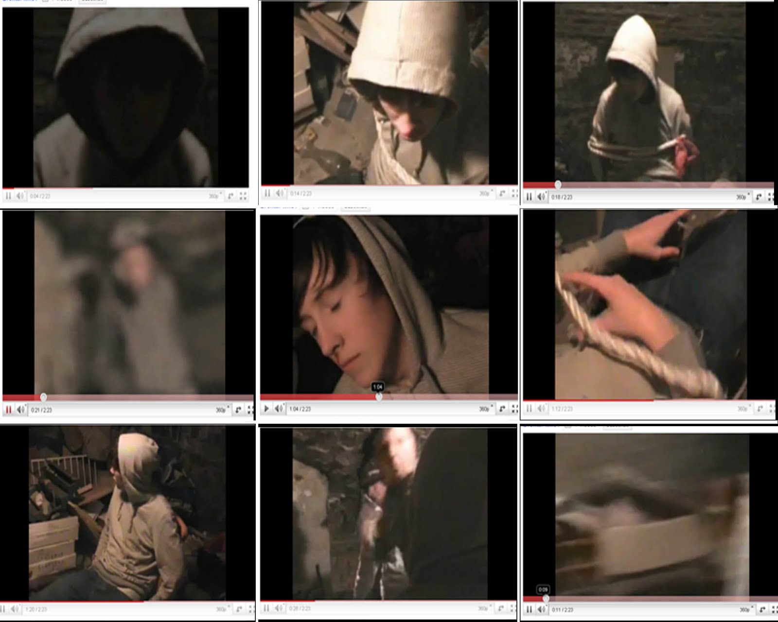
    After conducting all of this research, I made a collage to present my findings:


    (you can click on the image to enlarge it)